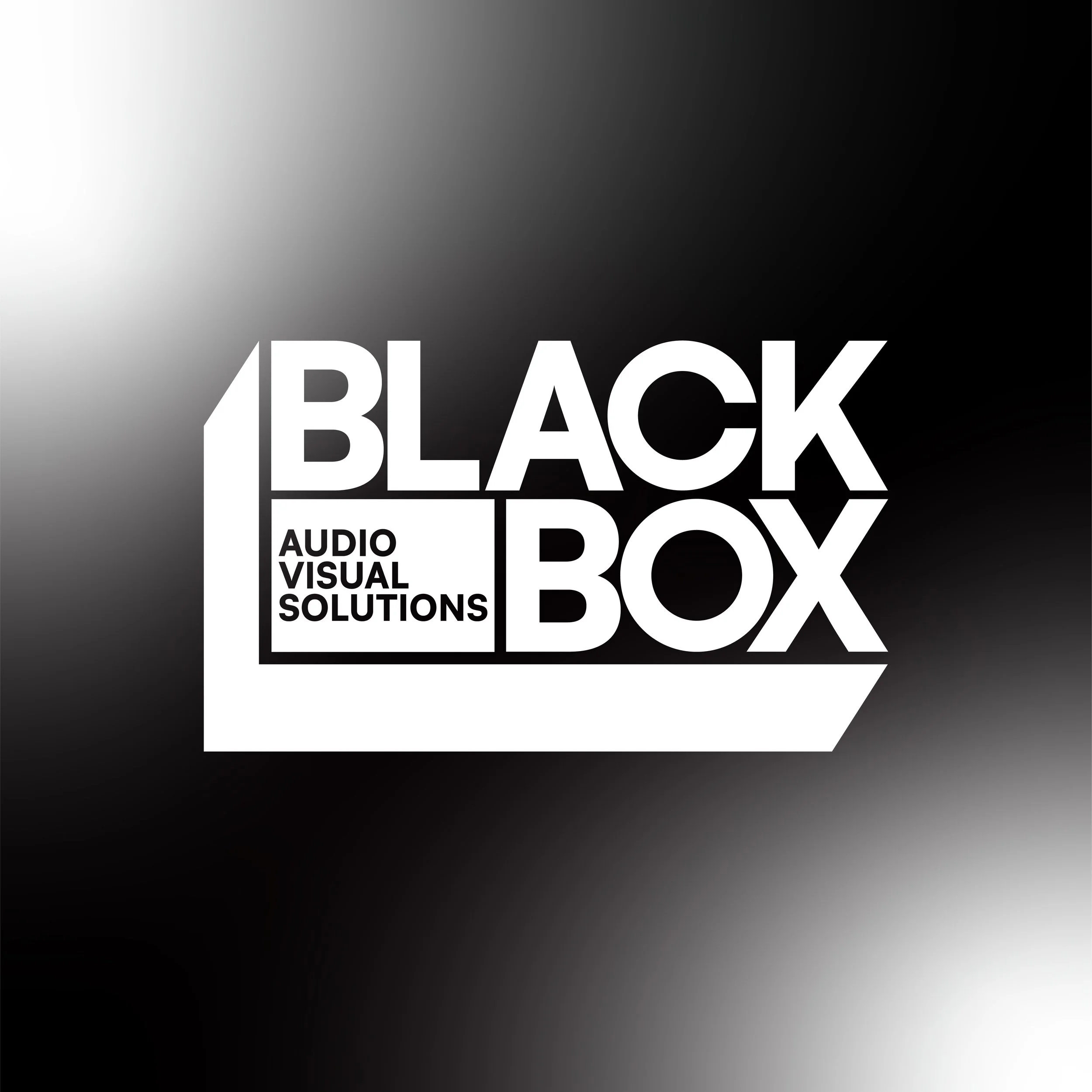
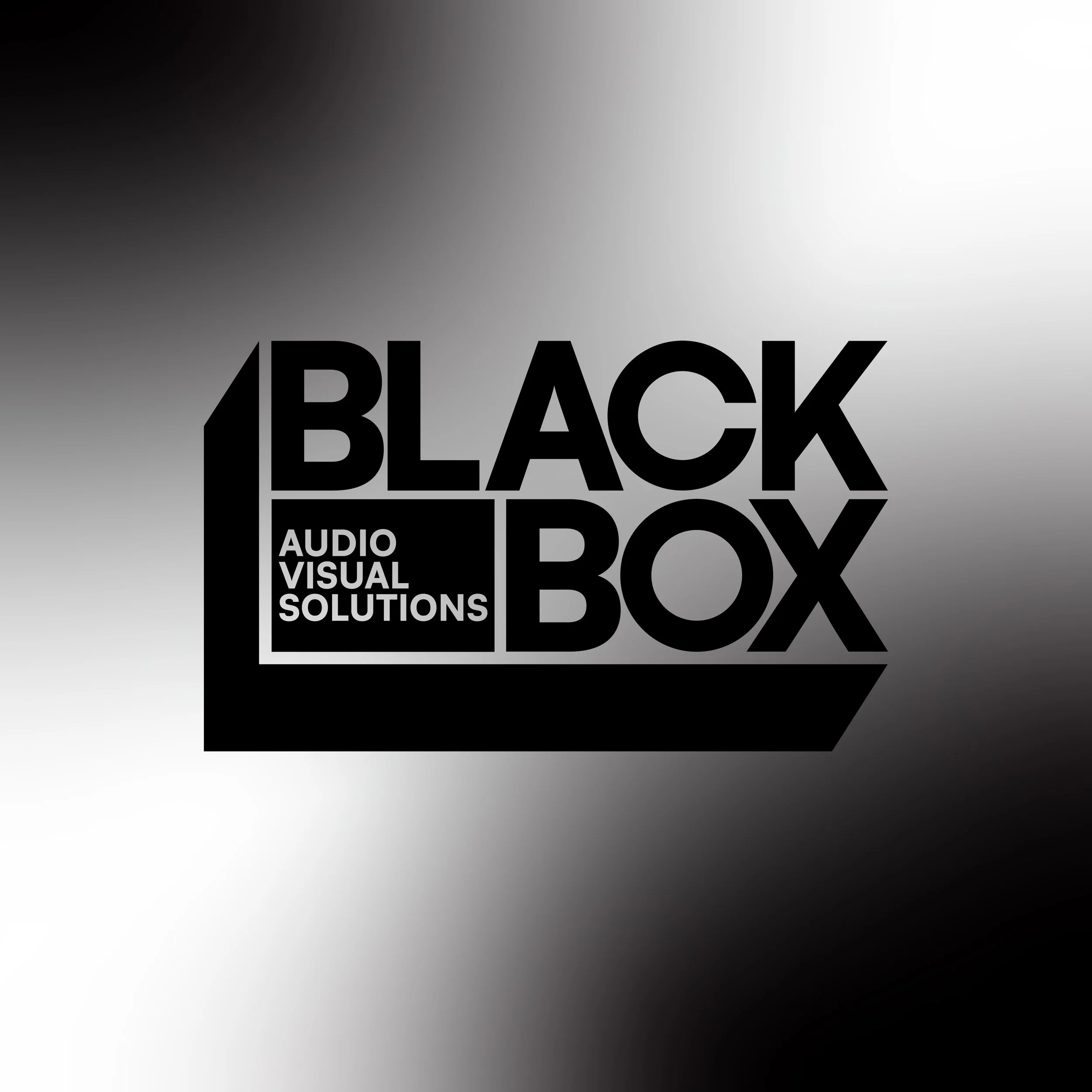
The Antigua Side: Part 1- Business Logos
So you hired me for a logo…what’s next?
When someone reaches out wanting a logo, the first thing Antigua Design Services Founder, Pedro Munoz Jr., asks for is the name of their company. It sounds obvious, but the name holds plenty of information: the company’s origin, why it matters, and what inspired it. Pedro uses all of that as a starting point.
“The more information, the better,” he said.
He asks about the type of company, what they do, how they started, and whether the name came from a moment or a goal they’re striving for. He wants to know what the client envisions, what colors they’re drawn to, whether they’ve tried branding before, and why they’re changing it now if it’s a rebrand.
He’s trying to understand the person behind the business.
“What made you want to start a business? What inspires you?” Those questions matter because a logo is a reflection of someone’s story.
Pedro’s not shy about asking detailed questions. If a client has a specific font or shape in mind, he wants to know why. If they don’t have any direction at all, he’ll help them find it. The initial conversation is where the gears start turning.
“Even with the initial conversation, my gears are turning… I already start envisioning how I would approach something like this.”
The entire process starts with good listening.
What Makes a Good Logo
Ask Pedro what makes a good logo, and he’ll always come back to the same thing: clarity.
“Clarity and recognition… for me that is timelessness.”
A good logo should be clean, simple, and easy to understand. It shouldn’t rely on trendy scripts or too many icons, and it shouldn’t feel busy or confusing. It should feel balanced, whether that’s symmetry, asymmetry, or something in between.
His architecture background shows up here: alignments, spacing, angles, structure. “I want a logo with structure… something with weight and balance.”
Pedro breaks it down very simply: start with shapes, colors, and letters. Build something simple that tells you what the company does. “Go down to the fundamentals… shapes and colors within the alphabet.”
A good logo doesn’t need to be complicated to make an impact.
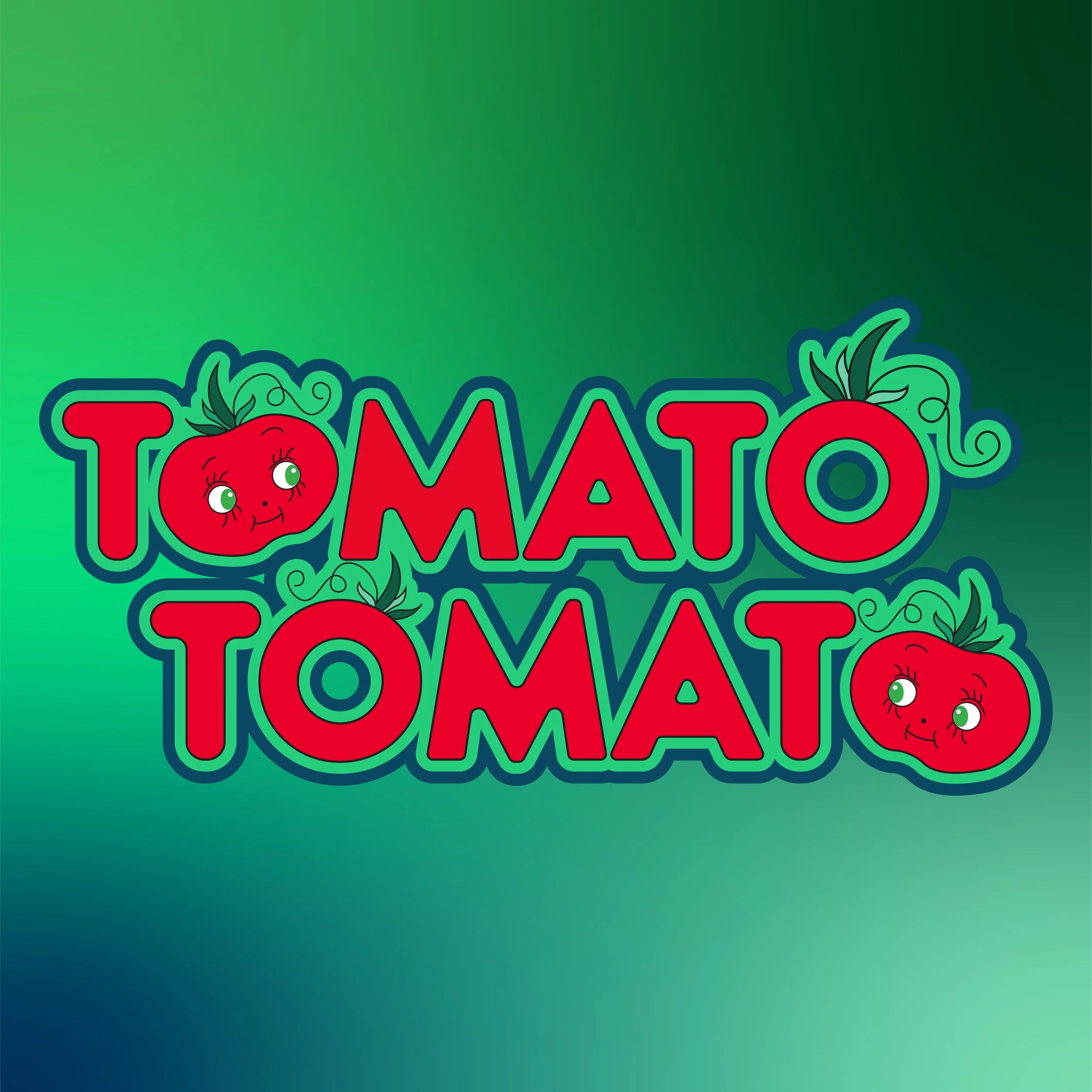
“Clarity and recognition… for me that is timelessness.”
Process
After the first conversation, he writes everything down in bullet points and sends it back to the client to make sure everything is aligned. Afterward, research starts. Pedro logs precedents, shapes, colors, visuals, anything that helps bring the idea to life.
Multiple versions make the client process smoother. To the first review meeting, he brings one version that reflects exactly what the client asked for, and other versions that explore variations they might not have considered.
“Options are important ’cause it shows that I listened… but also that there can be variations on what they initially envisioned.”
Sometimes the client loves their idea until they see it, and sometimes they end up liking a different type of style more. Sometimes elements from different concepts get combined. Options matter because they open the door to conversations that wouldn’t happen otherwise.
“If I just show what they want and they’re not happy, then it’s more work for me.”
Pedro is also mindful of how the logo will be used, whether it needs to be timeless, feel current, or work across different mediums. If a client doesn’t like the direction, he goes back to the beginning:
“What do you mean by this? What do you mean by that?” He’ll ask for visuals, comparables, anything that helps clarify the direction.
Honesty is most important. If a client wants something that already exists, he’ll gently push back. “You want something unique and different, not what someone else has done.” The process is collaborative, flexible, and rooted in communication.
Execution, Deliverables, and Longevity
Pedro’s design sensibilities are deeply influenced by 20th‑century modernism - particularly its emphasis on geometry, line work, and composition. He’s not alone! Many contemporary designers take inspiration from past movements.
He also draws inspiration from architects like Frank Lloyd Wright, whose work is known for dramatic contrasts: cozy, intimate hallways that open into grand, light‑filled rooms. That sense of spatial rhythm shows up in his event layouts as well.
Contemporary influences also play a role, including postmodern architecture of the 1990s, as well as the sculptural forms of designers like Frank Gehry. “Since the 20th century, I think we’ve gained a better understanding of how space can be very utilitarian,” Pedro says, “Nowadays, space is very accessible and free. It’s not dictated by a ‘style’ anymore. People can make it their own. The space becomes a vessel that you can just dress to your discretion.”
Though design has become more fluid and experimental, early inspirations are still helpful as context. Having an understanding of tried-and-true fundamentals can influence design decisions moving forward. Nothing exists in a vacuum, and even the most forward-thinking designs are inspired by something previous. As a designer, you need to know what you like and what you don’t like.
“Some of the styles, line work, geometry, and compositions of classic designers are very inspiring to me. I find myself looking to the past as I make design decisions in my work. It’s a healthy practice to do so.”