Event Logos vs. Company Logos: Designing for the Moment
When you think about logo design, you probably picture a logo for a business. You probably think of something recognizable, something that communicates what a company does, and something that will hopefully stick around for years to come.
What if the logo isn’t for a company? What if it’s for a wedding, a milestone birthday, a gala, or a corporate event?
According to Antigua founder Pedro Muñoz Jr., the fundamentals are still the same. Clarity and simplicity matter, but the approach can look a little different depending on what you’re designing for.
With a company logo, the goal is often longevity. With an event logo, it’s a little more about creating something memorable.
As Pedro puts it, designing for events means you can “be a little bit more creative” and “be a little bit more playful.”
So, what does that look like in practice?
Designing for events means you can “be a little bit more creative” and “be a little bit more playful.”
The Difference
A company logo has a big job to do. It needs to represent a business, communicate its identity, and remain relevant as the company grows and changes. Ideally, it’s something people recognize over time, whether they see it on a website, a business card, or a storefront.
An event logo has a different kind of longevity. It might only be used for a single day or weekend, but that doesn’t mean it has less value. Its purpose is to commemorate a moment.
As Pedro explains, “We’re not looking for a 5- to 10-year usage” with an event logo. Instead, “we’re looking for memories.”
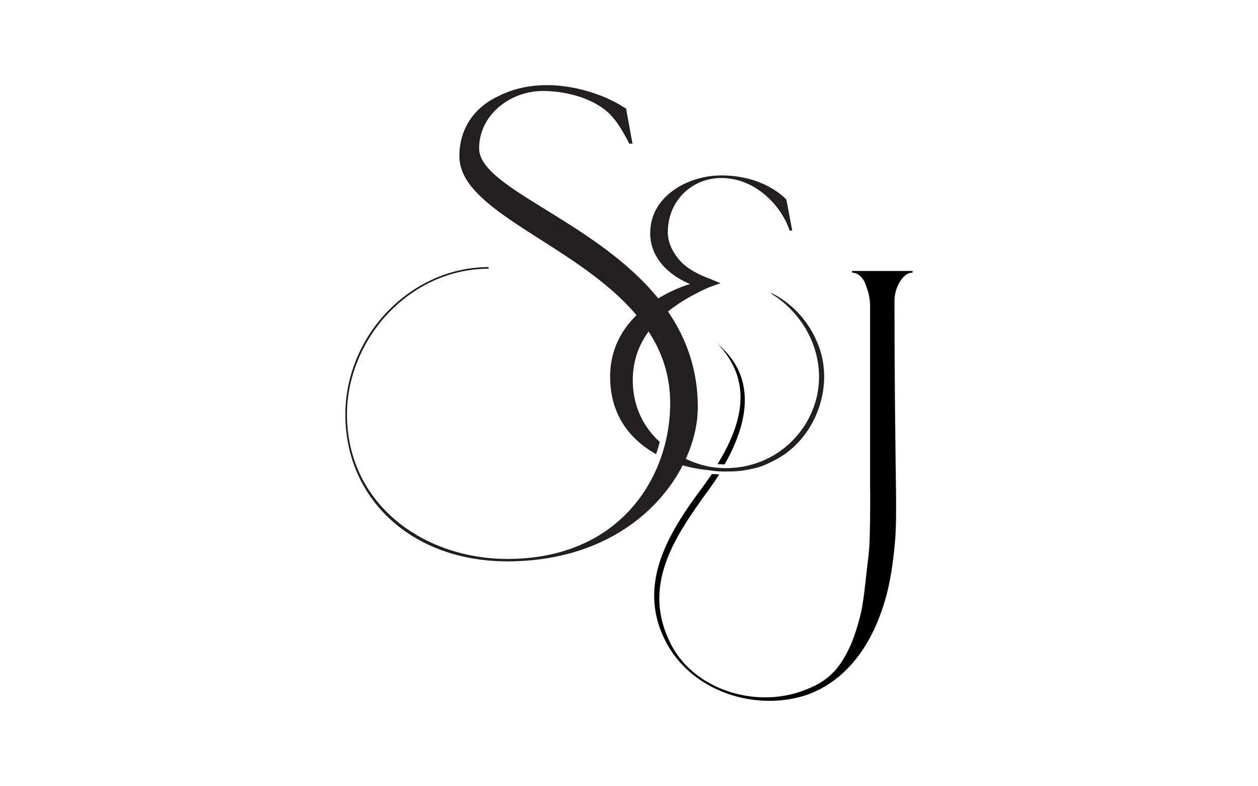
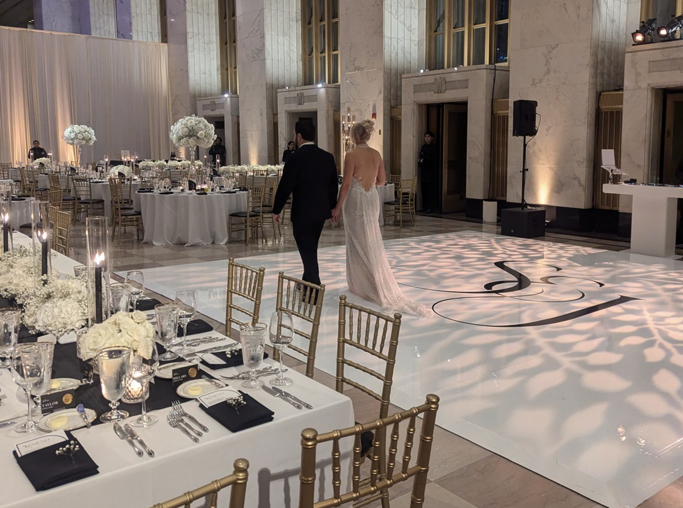
Think about a wedding monogram, for example. Two initials might intertwine, or a single letter might become the focal point of the design. That mark could appear on invitations, menus, place cards, a bar, or even the dance floor. Each application becomes part of the larger experience, creating a visual thread that connects the different elements of the day.
Pedro describes the goal as making the logo “memorable.” It’s a visual reminder that an event happened at a certain time and place, surrounded by specific people and details. The mark becomes one more part of what guests remember.
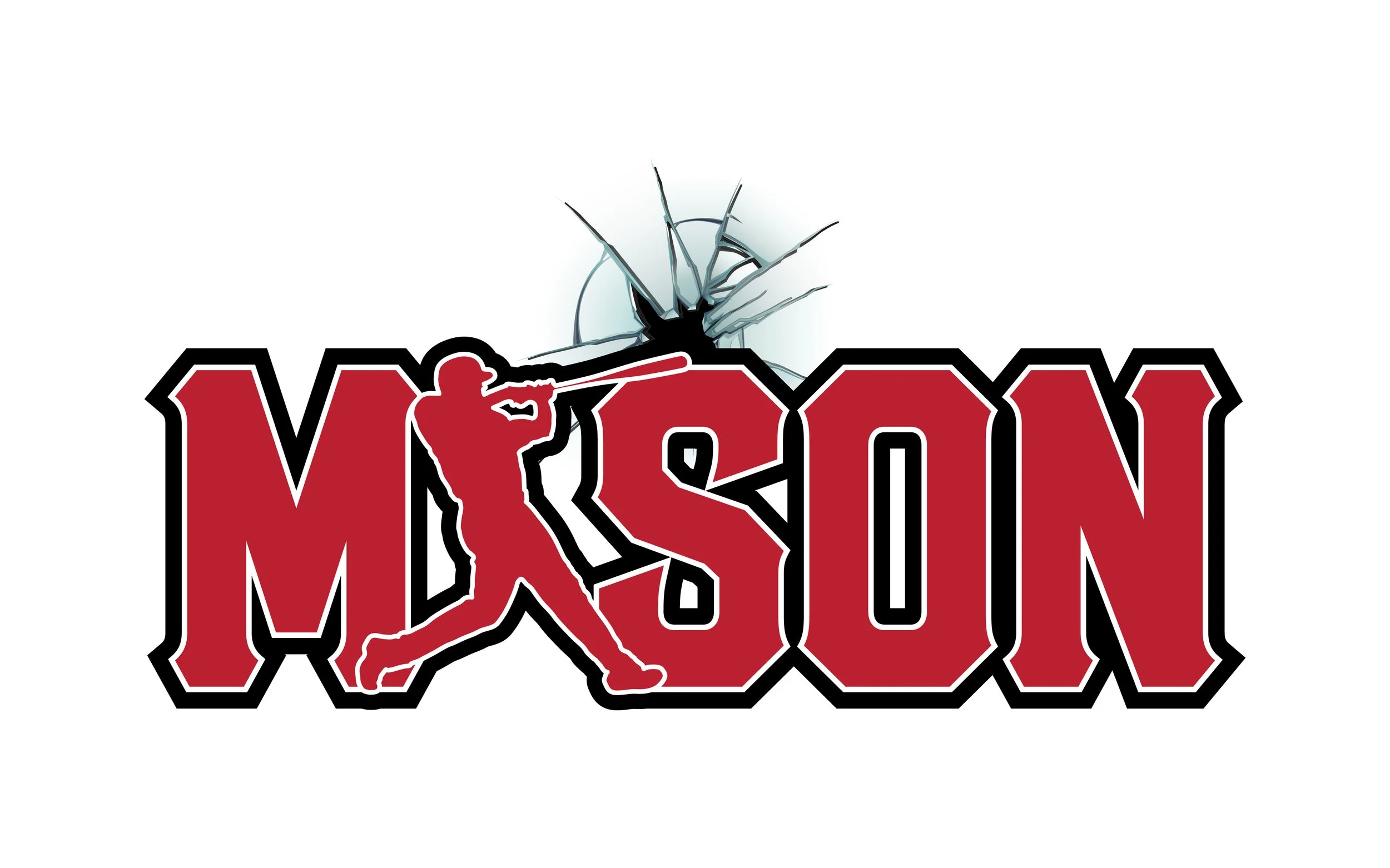
That difference gives us a little more freedom to experiment. As Pedro puts it, “You can be a little bit more playful” with an event logo than you might be with a company identity.
Still, the fundamentals don’t disappear. Even the most creative event logo needs to be clear and legible. The design can be expressive, but it still needs to work wherever it appears.
What Makes an Event Logo Sing?
The fun part of designing an event logo is that every event has its own personality. A wedding, a corporate gala, and a themed birthday party all have different goals, and the visual direction should reflect that.
For a wedding, a monogram might be the perfect fit. It’s personal, customizable, and easy to carry throughout the event. It can be subtle and elegant on a place card, then scaled up to make a statement across the dance floor.
When designing a monogram, Pedro says, “You want that to be the star of the show.” Whether it’s a single letter or two initials intertwined, the goal is to make the central element stand out.
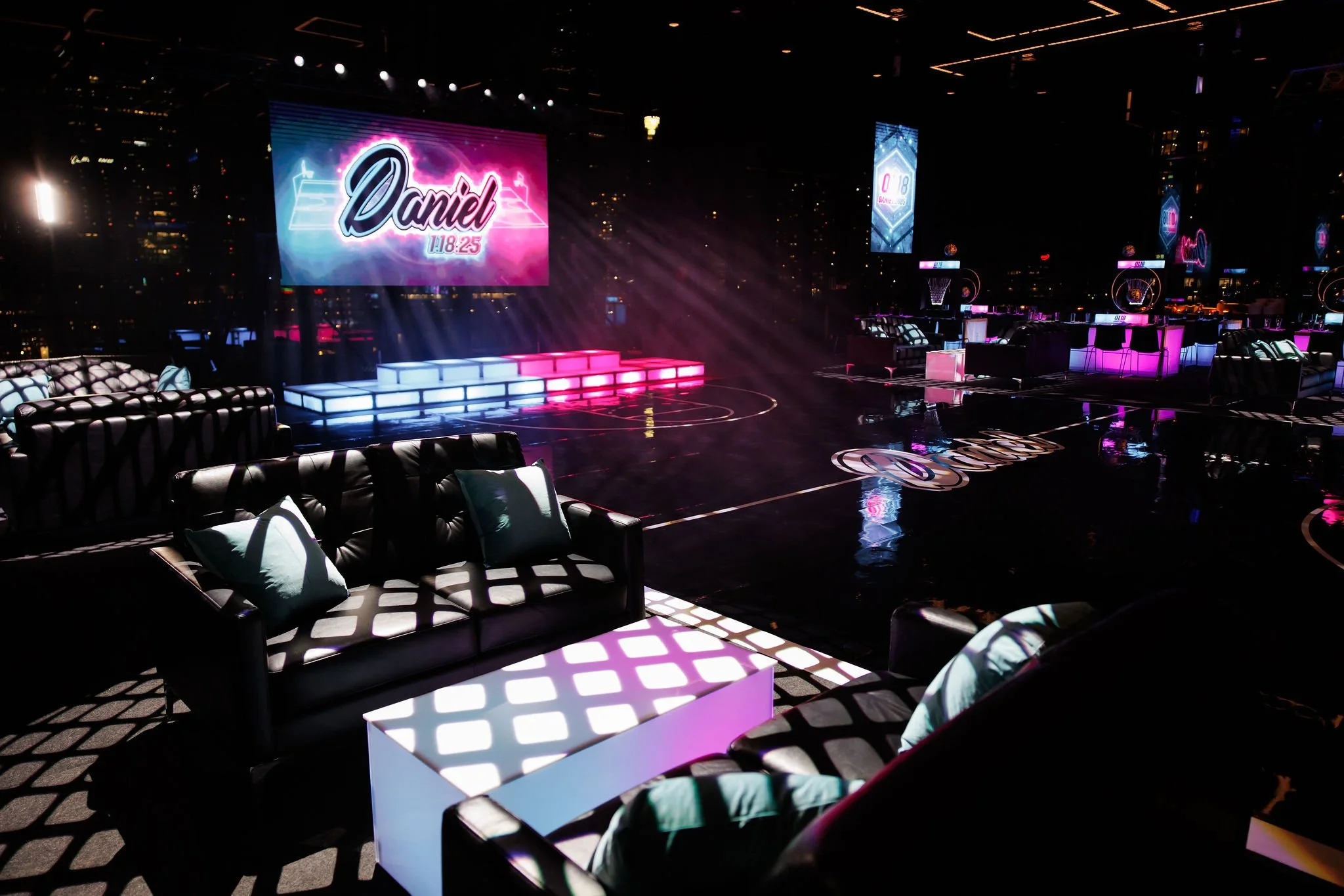
And it has to work across different surfaces and sizes. As Pedro points out, an event logo might appear “on a dance floor,” “on a stage or a bar,” or on something as small as invites, menus, and place cards.
A milestone birthday opens up a different set of possibilities. Maybe it’s a 50th birthday with a Great Gatsby theme, an Art Deco-inspired celebration, or a 1970s disco party. These themes give us a starting point for exploring typography, color, shapes, and imagery.
Pedro explains that his creative process draws on “my past knowledge of history or current events” to help find visual inspiration. When a client mentions a particular theme, it gives him a direction to explore and a foundation to build from.
Corporate events are a little different. If a company already has an established identity, brand recognition is usually important. The goal is to make the event feel connected to the company while still giving it something of its own.
Pedro describes creating a small logo to “commemorate the theme of the event.” If the company already has a logo, he can incorporate elements of the event’s theme to create something specific to that occasion.
Ultimately, there’s no single formula for what makes an event logo work. Sometimes it’s a set of initials, sometimes it’s the name of the event, other times, it’s a visual element that ties everything back to the theme. The key is finding the right balance between personality, clarity, and the experience you’re trying to create.
It Starts With the Client
Before opening a design program or sketching out concepts, there are a few things Pedro wants to know.
“When is the date? Where is it gonna be at? Is there a theme?” These are some of the first questions he asks when starting an event logo project.
From there, the details start to fill in the picture. Is there a planner involved? Is there a mood board? What colors are being used? Have the invitations already been designed? What linens are being used, and what kind of space will host the event?
As Pedro explains, “All these elements help me fine-tune something for them.”
Those details can have a real impact on the direction of the design. If the event is taking place in a contemporary space, for example, the client might want something that feels “contemporary and clean.” If the celebration has a more defined theme, that gives Pedro a starting point for researching and exploring the right visual references.
Of course, not every client comes in with a fully formed vision. Sometimes they know the feeling they’re going for but aren’t sure how to translate it into a logo.
In those situations, Pedro might create a mood board of his own. As he describes it, he’ll do some research “just to see what they like, what they don’t like, and work from there.”
Once he has a better sense of the client’s preferences, he starts developing concepts. He’ll create one option that’s close to what the client initially envisioned, along with “variations of what would work” based on their conversation and the event’s theme.
That process gives everyone something tangible to respond to. A client might realize that the original idea is exactly right, or they might discover that a different font, shape, or visual direction feels more appropriate.
For Pedro, it comes down to communication. As he puts it, “It’s all through communication.” Understanding what a client likes, what they don’t like, and what feels off-limits helps guide the design toward a result that feels right for the occasion.
“It’s all through communication.”
From the First Concept to the Final Deliverables
Once the design direction starts to come together, the next step is figuring out how the logo will actually be used.
An event logo rarely lives in just one place. It might appear on a large dance floor, a stage, a bar, or a screen. It might also need to work on something much smaller, like an invitation, a menu, a napkin, or a place card.
Those applications aren’t all the same, and the logo needs to account for that.
As Pedro explains, “Not all applications are the same.” Sometimes a design needs to be simplified for one use, while another application can accommodate more detail.
For example, a detailed monogram might look beautiful at a large scale, but some of those details could become difficult to see when the design is reduced. In that case, a simplified version might work better for smaller applications, while a more detailed variation can be used where there’s room for it to shine.
Color is another consideration. Pedro typically develops color and black-and-white versions, and he also considers how the logo will translate to screens and print.
These aren’t just technical details to figure out at the end. They’re part of designing something that can work across the entire event, from the first invitation a guest receives to the details they see when they arrive.
There’s also an opportunity to build out supporting elements. One of Pedro’s favorite additions is a pattern inspired by the logo itself.
“I love patterns,” he says. “So it makes sense. I’ll throw on a pattern.”
A pattern can carry the visual identity beyond the main logo, creating a cohesive look across different event materials and elements of the space. It gives the design another layer without needing to repeat the primary mark everywhere.
The exact deliverables depend on the project and how the logo will be used. That’s why understanding the event and its applications early on is so important. It allows the design to be developed with the final experience in mind, rather than trying to make one version fit every situation.
A Little More Room to Play
One of Pedro’s favorite parts of designing event logos is the creative freedom that comes with them.
“It’s the creativity,” he says. “You can be a little bit more creative.”
From colors and shapes to forms and themes, event logos offer opportunities to explore ideas that might not make sense for a company identity intended to last for years.
A birthday party might call for something playful and bold. A wedding might benefit from a more personal monogram. A corporate event might need a design that balances the company’s established identity with a new theme.
But creativity isn’t about adding as many elements as possible. It’s about finding the details that make the event feel personal and give people something to remember.
When asked what advice he’d give a designer who’s used to creating company logos and is taking on their first event logo, Pedro’s answer is simple: “Be a little bit more open-minded. Be playful.”
It’s a reminder that the purpose of the design should shape the process. A company logo is designed to represent a business over time. An event logo is designed to capture a moment in time.
Both require thought, collaboration, and a clear visual direction. But when the goal is to create something that commemorates a person, a celebration, or a shared experience, there’s a little more room to experiment.
When the design reflects the people, the occasion, and the experience itself, even a logo created for a single day can become a memory that lasts much longer.